"Balance of Nature"
Material: Adobe Illustrator, Sketch Paper, Pencil
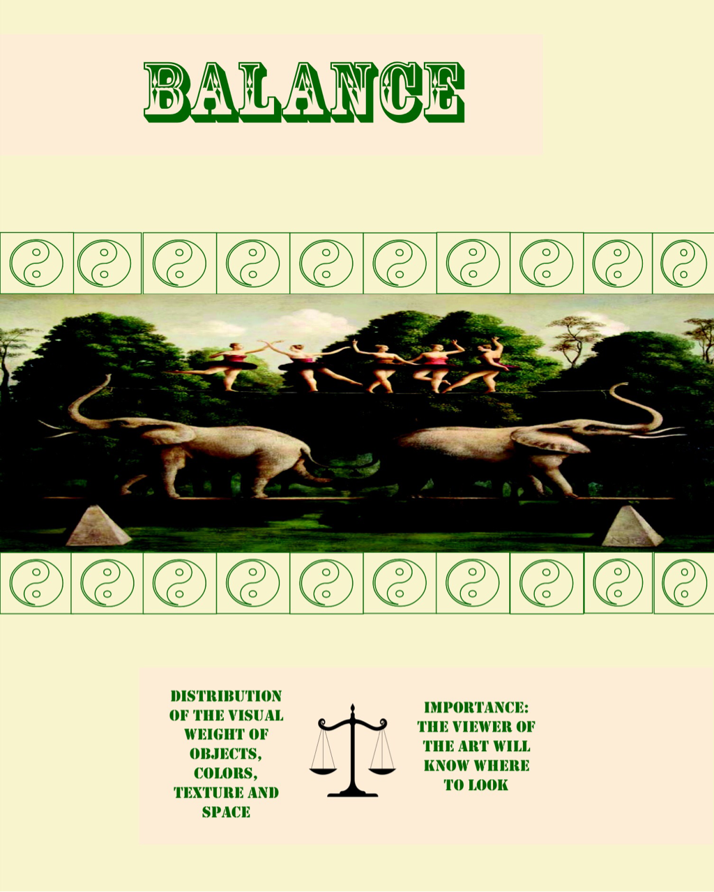
The goal of this project is to create a poster using the rule of thirds or the rule of phi. For my poster, I decided to make the theme Balance of Nature. Nature, I believe, is the epitome of balance. Even though the environment is constantly changing nature has its way of balancing its systems. Originally, balance of nature, was a proposed theory that meant, "All ecological systems are in the state of equilibrium". This is also known as homeostasis.
For my project, I decided to use earthly colors such as green, brown and black. These colors can also be seen in the painting that I chose. Moreover, I placed the painting at the center to emphasize my title and theme. I also placed Yin Yang symbols, as it is a prominent symbol of balance, and everyone can relate to it. Also, I used another logo between the texts on my second box to fill up the negative space. With that being said, I also placed the Yin Yang symbols around the picture to fill up the negative space around the painting. Lastly, I only placed a few text on my poster because I want to get my point across easily, and I also colored the text box light brown to emphasize my text, as well as, it is pleasing to the eyes of the viewer.
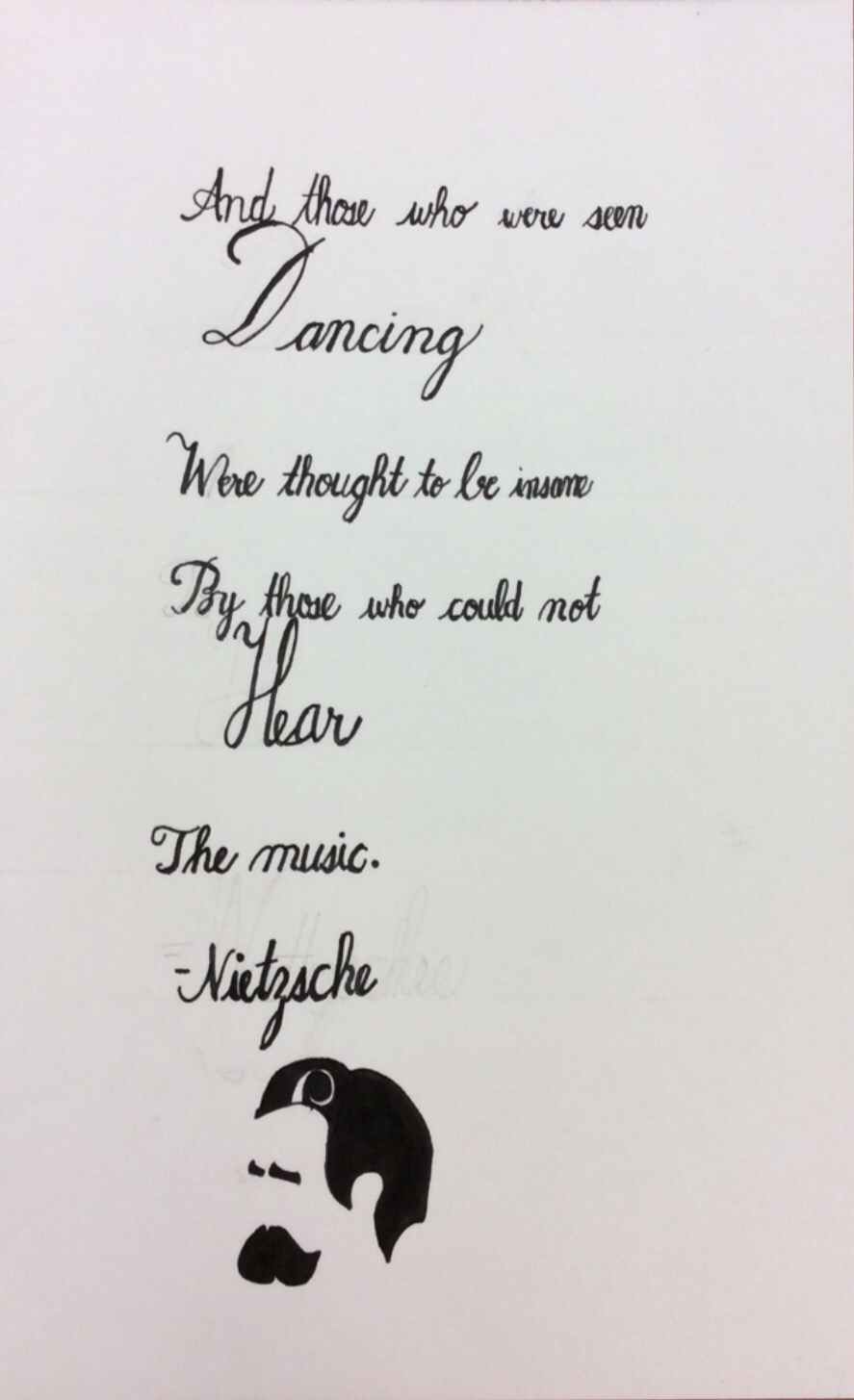
"Out of Nietzsche's Mouth"
Graphic Design I
2015
Materials: Calligraphy Pens, Drawing Paper, Pencil
Nietzsche is one of the most controversial philosophers of all time, especially with his statement, "God is dead." However, my religious beliefs do not collide with my admiration for Friedrich Nietzsche. In my opinion, his rationality and logic made me admire him. His greatest contribution to philosophy was the idea that everything happens over and over into infinity, which is evident in the past and current events.
When this project was introduced, I knew I wanted to use a quote by Nietzsche. At first, I was torn between using Illustrator or calligraphy for my project. However, I decided to use calligraphy because I am blessed with such good handwriting, and why not use it? I wanted my project to be simple as possible, so I decided to only use a black pen. Black is a color that I always associate with simplicity and mystery. Moreover, I wanted the viewer of the artwork to have their own interpretation of the quote, because if I used colors such as yellow or orange that can be associated with bliss or happiness, then I am confusing the reader by adding bias to the meaning through color. The font that I used was Engrosser's Script because it is classy, but not in a way that it is so formal. At the end, I drew a cartoonized version of Friedrich Nietzsche because I want my piece to have a modern feel to it.
When this project was introduced, I knew I wanted to use a quote by Nietzsche. At first, I was torn between using Illustrator or calligraphy for my project. However, I decided to use calligraphy because I am blessed with such good handwriting, and why not use it? I wanted my project to be simple as possible, so I decided to only use a black pen. Black is a color that I always associate with simplicity and mystery. Moreover, I wanted the viewer of the artwork to have their own interpretation of the quote, because if I used colors such as yellow or orange that can be associated with bliss or happiness, then I am confusing the reader by adding bias to the meaning through color. The font that I used was Engrosser's Script because it is classy, but not in a way that it is so formal. At the end, I drew a cartoonized version of Friedrich Nietzsche because I want my piece to have a modern feel to it.
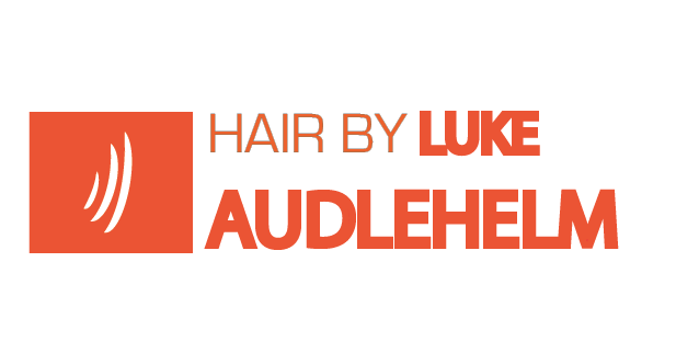
Hair Logo
Graphic Design I
2015
Materials: Adobe Illustrator, Pencil, Colored Pencils, Sketch Paper
For this project, I made a logo for a client. At first, I thought I wanted to include the client's face. However, I wanted it to be more straightforward. Doing this project, I have also learned that when collaborating with other people you should always find ways to blend your ideas together to make an interesting piece. At the same time, if someone has a better idea or wants some changes, you should be open because it improves the artwork at the same time it makes it more interesting.
My client wanted his logo to be modern and vibrant. So I decided to use a font that is not formal. I also made the "Hair By" thinner for contrast with the name of my client. I used all uppercase letters to get more attention. Beside the text, I made an abstract drawing of hair, so if I want to scale my client's logo, I could not put his full name; only the abstract logo itself.
Lastly, this project taught me that colors and the font style greatly influence the message of an art piece. Moreover, it made me realize that the biggest companies have the simplest logos. Yet, they are the most attractive. This project applied the theme, "The simpler, the better.", as I did not exaggerate the design in order to get the point across easily.
| infographic_copy.pdf |
The Top Three Firms and Their Current Status
Graphic Design I
2015
Materials: Adobe Illustrator, Sketch Paper, Pencil, Ink Pen
For this project, I made an infographic regarding the top three banks of Wall Street. I chose this as a topic because it is essential for people to know the status (e.g. revenue) of the biggest firms as it holds the money of most people, especially the billionaires. Moreover, it is essential for people to realize that once Wall Street goes down, the world will go down. It is also important for people to be aware that the revenue of the firms plays a huge role with the number of employees they have. Besides the significance of banks in our lives, this topic is important to me because during my trip in New York last summer, Wall Street struck out to me the most because it is a very rapid and serious place compared to New York's busy city life. I wanted my infographic to be formal,simple and straightforward. The colors of my infographic are present in the logos of the firms, in order for the elements to easily blend. For my emphasis, I placed a curved text, "Financial Statistics" to give a hint on what my infographic is going to be about. To present the information, I used dollar logos and people logos. In order to see the relationship, I placed an equal sign between the logos, "More money results to more people." In addition, I also placed a legend in order for the viewers to know an estimate amount of the revenue and employees. I also placed images to make the information I presented earlier more credible. I also placed a gradient, so that the information will look more organized. Lastly, I blended a money image in the background to make my infographic more presentable.
